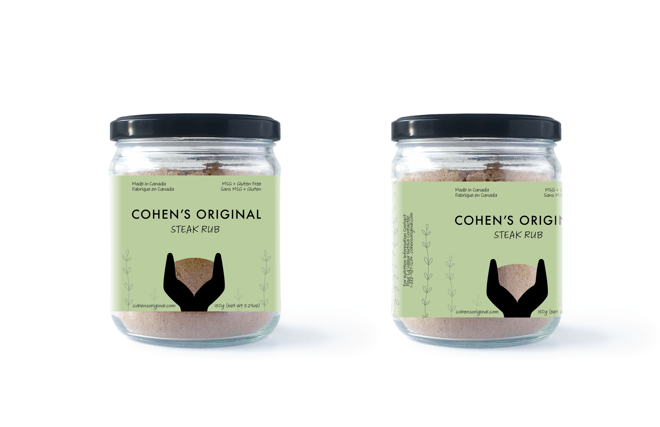
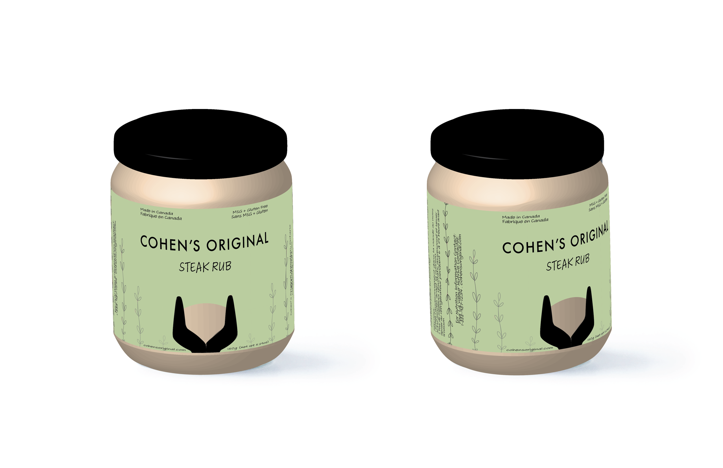
its in the jar
Project Title: Package Design – Cohen’s Original Steak Rub
Client Name: Toronto Film School – Student Work
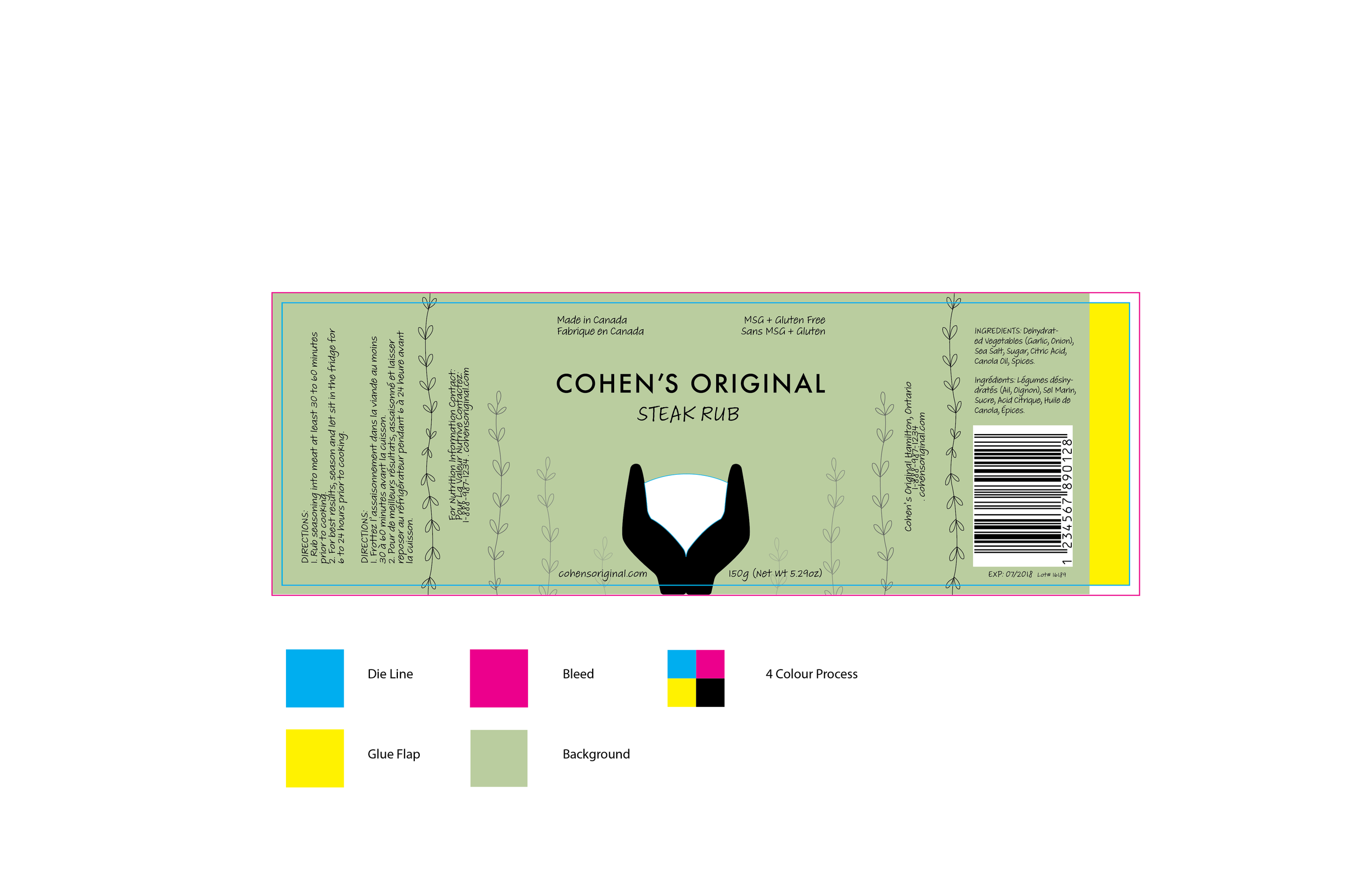
Brief: Design a custom die-cut label for Cohen’s Original new Steak Rub. The Steak Rub is new to their line of gourmet and artisan products made from the best quality ingredients. The label will reflect the product, the brand, and what it means to live and eat well.
Roll and Skills: I developed concept and designed illustration and layout for packaging using Adobe Illustrator. The colour palette of green and black creates a sense of high-quality alongside the use of a cut out to focus on the product. Green connects the product with wholesome natural high-quality ingredients from the earth. The relatively large amounts of negative space create space and a calm high-quality feeling in the design. While the symmetrical layout creates balance and a feeling of attention to detail. Handwritten fonts add to the artisan and handmade feeling of the brand. The hierarchy of font size maintains a focus on the brand identity while guiding the reader to information about the new product.
Results: The label design for Cohen’s Original Steak Rub reflects the brand and product identity by using graphics, typography, and colour to bring a high-quality feel to a handcrafted product that focuses on quality ingredients.


